The Third Agricultural Revolution

Zero-carbon cress

You might be surprised to hear that the world’s first underground farm is located 33 metres below Clapham High Street. Founded in 2015, a former World War Two bunker is now home to Growing Underground, farming a variety of microgreens and herbs with the aim of producing zero-carbon food. To help achieve this, the farm has a digital twin based at the University of Cambridge. The farm utilises 25 sensors to measure every element of the farming process, including humidity, nutrients, and water levels. This is used to create a virtual representation of the farm, which monitors the crop growth and provides feedback. The environment can then be tweaked to create the optimal growing conditions. This impressive operation uses 100% renewable energy, requires less space than traditional farming and has no need for pesticides. It’s also had impressive results:
  • growing time for some crops reduced by 50%
  • yields increased by 24%
  • grows 12 times more per unit area than a traditional greenhouse
The produce is then taken to New Covent Garden Market for distribution across the capital (including London Marks & Spencer food halls), helping to reduce food miles.  

Precision Farming

What is precision farming and how does it work? While Growing Underground is the first underground farm, the use of data in agriculture is rapidly developing into the Third Green Revolution. Known as precision agriculture or smart farming, data and technology has the potential to help solve the problem of feeding the growing population by enabling farmers to grow more efficiently. Environmental sensors installed in the fields record climatic information and soil requirements across large areas of land. Combined with satellite images captured by agricultural drones, interactive maps capture the health state of the field. This means anomalies and issues such as nutritional deficiencies, irrigation issues and localised parasitic attacks can be identified and solved with targeted actions. Precision farming can also extend to livestock farming, allowing farmers to monitor the needs of individual animals and adjust their diet, which in turn helps to prevent disease. They are also able to identify and isolate sick animals.   What are the benefits of precision farming? Given the exponential increase in population, the number of people estimated to require food in 2050 is 9 billion. Precision agriculture has the potential to help achieve this by minimising the exploitation of water and fertiliser resources without compromising the physical and chemical quality of the soil. This contributes towards the movement to a sustainable food production model, as well as being financially beneficial for farmers whose yields and productivity are boosted. Currently, only a small percentage of farmers invest in any form of precision agriculture as educational and economic challenges remain a barrier to expansion. Not only does it require a significant initial investment, making it largely unattainable; it also requires farmers to understand and analyse their data and findings, meaning there is a long way to go before precision agriculture is scaled up across the world.  

Data Science for Social Good

Growing Underground conduct this research with the University of Cambridge and the Alan Turing Institute, who focus on Data Science for Social Good. Their aim is to help not-for-profit organisations and governments make the best use of their data in science. This enables them to improve their services and interventions to eventually improve lives. Recognising the power of data science in development and solving global challenges across education, health, energy, public safety, transportation and economic development, the Alan Turing Institute work on solving real world problems. For example, working with Ofsted to improve the quality of care and education, and with the World Bank to identify and analyse corruption risks in public administration. Additionally, work aimed to “supercharge” the Sustainable Development Goals through simulating the impacts of government spending has the potential to change and save lives as countries adopting the methodology move closer to achieving these goals. The research carried out by the Alan Turing Institute acts as an important reminder of the potential and power of data in solving global issues. Given the increase in advanced data collection and analysis methods, there is increased capacity for NGOs and governments to collaborate to find solutions to the environmental and societal challenges of today and tomorrow. Want to become more data-driven? Download our ebook today to find out how.

About Ipsos Jarmany

Ipsos Jarmany is a team of expert data scientists based in London, UK. Contact us to discuss how we can help you get more from your data.


References

The advantages of precision farming Smart farming as the future of architecture Growing Underground

Power BI tips & tricks

To be able to benefit from a truly interactive report personalised with your KPI’s and brand, extract business intelligence and share insights effortlessly, it’s just as important to spend time developing the front end of your Power BI report as it is the data model in the back end. Power BI has many features which can help achieve this and provide a truly interactive experience for the report’s end user.


Designing a Coherent Report: Themes

Themes in Power BI allow you to set a colour and font scheme template for your report. Whether to ensure consistency between a reporting suite, allow easy reading by the visually impaired or to align with your branding, themes allow appropriate design changes to be applied in an instance across a report.

You can either make use of one of Power BI’s built-in themes with predefined colour schemes to do this or you can customise a theme to meet your needs. This customisation ranges from setting page backgrounds and font sizes to setting sentiment colours and the background transparency of a card. To create a truly comprehensive theme, JSON files can be imported where the simplicity of the code can range from setting the theme’s name to specifying that different font families be used for specific visuals.

Not only do themes allow design changes to be applied quickly, but they ensure consistency across reporting, easing the end-user’s navigation through reports.


Unlocking Data: Drill Through and Drill Down

Another key tool which can be used in Power BI to help the user gain a more compressive picture of the data are the Drill Through and Drill Down Functions. Drill Down allows the report user to “Drill Down” to another level of granularity used in a visual’s hierarchy to delve deeper into a period of time or market for example.

To provide the end-user with a truly detailed insight into the data behind the visual, the Drill Through tool can be used. This allows the report designer to take the user from one visual of a report to another page to focus on a specific article. On this page, the report designer can create multiple views with different measures focusing on the one article.


Creating An App-like Report: Buttons and Bookmarking

Buttons and bookmarks are another incredibly useful technique in enhancing user interactivity with a Power BI report. Buttons can be used simply to allow the user to quickly navigate between the different report pages but can be further used with the help of bookmarking to allow the user to quickly switch between different trends and visuals within the same location of a page. They can be further used to incorporate information pop-ups into your report and allow you to create in depth filter panes.

The use of buttons and bookmarks allows you to create a report with the functionality and usability of an app, eliminating the need for cluttered report pages and facilitating rapid navigation between visuals.


Scenario Modelling: What-if Parameters

Another great tool to improve a report’s interactivity are What-if Parameters. What-if Parameters allow you to model different scenarios and view the influence of certain parameters on your KPIs.

To do this a new What-if Parameter can be created, where a data type and range of numbers is specified. This creates a single column for your range of values which can be placed onto a slicer as well as a selected value measure which can be used as part of a larger DAX expression to model different scenarios.

This tool helps the user to determine the impact of particular parameters on KPIs, helping them to make proactive business decisions.


Enhancing Interactions: Interactions Between Visuals

By default, interactions between visuals in Power BI are enabled. These allow page visuals to be filtered based on an interaction with another visual on the same page. While this interaction is useful to compare different visuals it can create confusion on larger report pages with many visuals. Therefore, only enabling filters to interact with visuals and only enabling interactions between visuals in close proximity (or not at all based on preference) would be a simple technique to improve report usability.


Visual Selection

Even the choice of visual can have a great impact on how data is perceived. For example, if many data points are going to be applied to a visual, a stacked column chart should be considered as opposed to a line chart. A line chart could create a confusing picture with multiple lines making it difficult for the user to compare data points, whereas a stacked column chart will allow easy interpretation of figures in this instance.


Conclusion

By adopting some of the many reporting features that Power BI has to offer, it’s possible to create a truly interactive and coherent report, facilitating a connection between data and decision making.


References

5 IDEAS to take Power BI reports to the NEXT LEVEL – YouTube

Can What If parameters help in Power BI reports? – YouTube

Set up drillthrough in Power BI reports – Power BI | Microsoft Docs

Use report themes in Power BI Desktop – Power BI | Microsoft Docs

Power BI – Edit Interactions features – Power BI Docs

Four key features of Power BI

Power BI is one of the leading data visualisation tools providing quick insights into a company’s performance and allowing data-driven business decisions to be made.

Power BI allows users to collate data from multiple sources and present it in the form of interactive reports accessible through a self-service method. However, the functionality of these reports depends greatly on decisions taken in the data modelling stage of the report’s construction and these decisions will have a significant impact on the report’s efficacy.


Here are 4 features you should be aware of:


1. Benefits of Calculation Groups

Since the introduction of the Tabular Editor Add-In, Calculation Groups can be utilised to eliminate the use of excess measures in your report. Instead of needing to create similar intelligence across multiple KPI’s, a single grouped one can be made. Therefore, to see YoY, WoW and MoM metrics for revenue and sales one “Calculation Group” containing three measures for this time-based intelligence can be substituted in place of six individual measures. Not only does this clean up your report by reducing the number of fields contained but it also improves performance.


2. Future-proofing your reports

Aggregating data is also key to creating a robust, future-proof model. By only aggregating your dataset to the granularity you require in your report, redundant data isn’t pulled, reducing the model size as well as speeding up data refreshes. The benefits of aggregations may not be obvious at first but will be noticeable over time as data accrues and your model grows.

Being scrupulous is key to improving reporting performance. You should go further than aggregating your data by removing unnecessary columns from your data model, especially those with many unique values. This will improve data compression and thus improve performance. Furthermore, any unnecessary Applied Steps in Power Query should be omitted. For example, if you’ve previously sorted your data in Power Query to help you inspect it, remove this step to be certain that Power BI isn’t performing any superfluous tasks.


3. Utilising defaults

As default, Auto Date / Time is enabled in Power BI. Although useful in providing support to build date hierarchies, hidden date tables are created for each date field in your model to do this. A more efficient use of Power BI resources would involve bringing your own date table into your model (imported or created using DAX) and disabling Auto Date / Time. This would allow you to handle your date filtering requirements without your model making inefficient use of resources.


4. Optimising DAX Expression Performance

Even the way in which you calculate your KPI’s can affect your report’s performance. Therefore, it’s vital to maximise the efficiency of DAX expressions which can be achieved by declaring variables. Instead of repeating calculations within an expression, a variable can be declared to define this functionality and can then be called upon later in the expression. For example, in a YoY calculation the best practice would be to declare your prior year calculation as a variable rather than to calculate it twice within the YoY expression. This can drastically reduce the query time as expression logic isn’t unnecessarily repeated, rather a metric is calculated once and later just referred to.

As well as improving query performance, the use of variables helps to improve an expression’s readability which will prove beneficial if the expression needs to be debugged at a later stage, with expression logic able to be checked individually rather than in a nested format.


A robust and efficient data model is the foundation of any good Power BI reporting solution. The above techniques are just some of the many best practices Power BI has to offer for improved reporting performance. By deploying your selection of Power BI’s many tools to optimise report efficiency and usability, you can achieve the optimum reporting solution for your needs.


Data-driven decision-making, made easy with Ipsos Jarmany

About Ipsos Jarmany

Ipsos Jarmany is a team of expert Power BI consultants based in London, UK. Contact us to discuss how we can help you visualise your data through Power BI.


References

REDUCE the # of measures with Calculation Groups In Power BI – YouTube
The How and Why of Power BI Aggregations – YouTube
A comprehensive guide to Power BI performance tuning – SQLGene Training
2 ways to reduce your Power BI dataset size and speed up refresh – YouTube
Power BI variables with efficiency and debugging – Learn DAX
DAX: Use variables to improve your formulas – Power BI | Microsoft Docs

The Rise of Data Visualisation

The age of Big Data is creating an avalanche of information that will only grow over time, and with that comes the importance of how to visualise it. Extracting knowledge from data is undoubtedly the primary function of data visualisation, letting us breakdown vast amounts of information into manageable insights that are easy to interpret.

Today, it’s hard to think of an industry that doesn’t benefit from making data more understandable. And the pandemic is a very real-life example of how to communicate Big Data by delivering explanations and possible impacts that support government policy.

Beyond the pandemic, the rapid adoption of the Internet of Things (IoT) and Artificial Intelligence (AI) result in a massive data pool that needs visualising.

Want to become more data-driven? Download our ebook today to find out how.


What is Power BI?

A good visualisation tells a story through combining data and art, and one of the tools at the forefront of empowering this is Microsoft’s Power BI.

Power BI is a visualisation tool that allows users to bridge the gap between data and decision making. By collating, cleaning and analysing data from a huge variety of sources, Power BI allows high-quality visualisation of data, achieved through self-service reports that boast a highly intuitive interface. The outputs are easily digestible for end users and allow organisations to share insights that drive rapid data-driven decisions.

Power BI Top 3 Features

1. Custom visualisation

Power BI boasts a huge variety of standard visuals to populate your reports with, each with extensive format options that enhance the presentation and functionality of any dashboard.

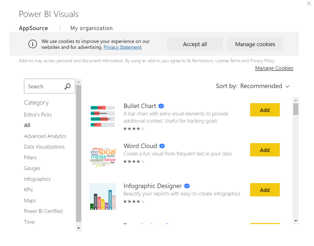
Power BI allows easy access to a library of additional free visuals such as Bullet graphs, Decomposition trees, Gantt charts and many more. All in-built custom visuals are shared with the Power BI community through the AppSource Market Place and can be imported in seconds ready to be used in your own reports.

However, every business operates differently and if the default selections are not sufficient, the powerful personalisation capabilities do not stop there; users can also build their own custom visuals to serve their complex data needs whilst maintaining consistency with their brand.

Power BI screenshot

2. User-Friendly Interface

One aspect that sets Power BI apart from its competitors is the highly intuitive interface that makes it extremely user-friendly and easy to navigate. You don’t need dashboard experience to take full advantage of Power BI; outlined below are just a few of the many interactive features that allow even a novice user to get instant answers to their data questions.

Natural Seach Q&A:

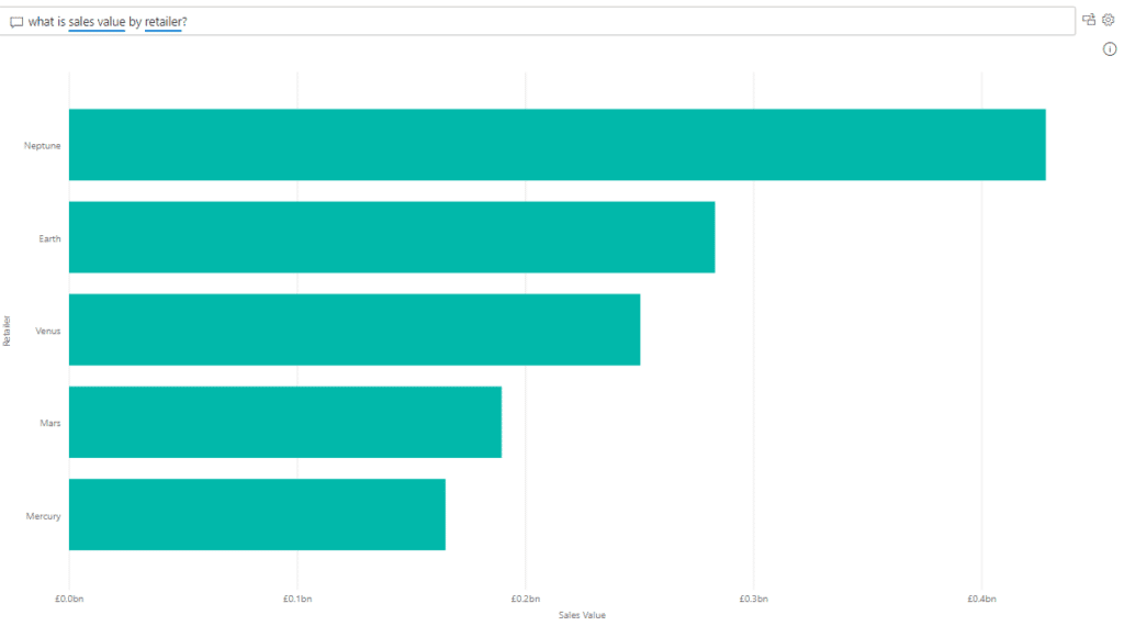
Some businesses may have stakeholders that aren’t particularly tech-savvy or simply don’t have time. Power BI’s natural language search feature is the perfect solution. It allows users to draw insights and create visuals using plain English search terms without any need for code or syntax. By double clicking an empty part of your report, you can ask specific data questions like; “What is the sales volume by region and by month?”. Power BI will run the related queries in the background and generate a visual that best represents the data you’ve asked for. The mobile Power BI application now also supports voice recognition Q&A so you can get answers to your data questions on the move.

Search query screenshot

Smart Narratives:

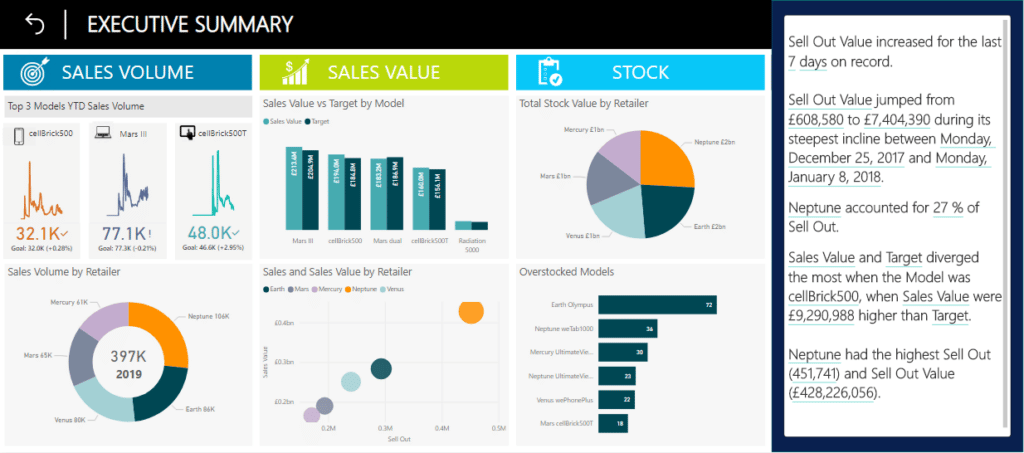
Good visualisation should always tell the story itself. However, sometimes words are helpful for identifying specific trends or addressing key takeaways. The smart narrative does exactly that through automatically summarising all the visuals on a report page and updating with every refresh.

The narratives can be customised by adding dynamic values; you can map text to existing fields in your data model or use the natural language search function to define a new measure to map text to, without the need to use DAX. Smart narratives are also dynamic and therefore generated text and values update when you cross filter on any visual.

This helps users understand the data and gather quick insights which they can communicate to others, without needing to spend time exporting screenshots of reports and writing up related commentary.

Screenshot

Cross-report Drill-through:

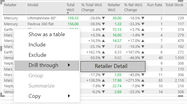
Another great option available in Power BI is the ability to “drill-through” to another report, allowing you to find related insights with ease. An ideal dashboard journey allows the user to start at a high level and then “drill-through” to more granularity in subsequent lower-level detail reports. Power BI’s cross-report drill-through feature does exactly that.

It allows you take a datapoint on one page and apply this as a filter on another page, simply by right clicking a visual. It connects two or more reports that have related content, and lets you jump from one report to another whilst passing filter context along the cross-report connection.

Different users of a dashboard will have different data needs depending on their role and you may want to build multiple reports for the various audiences. This feature allows you to tailor your data presentation for specific user groups without the need to cram every visual into one view.

Report screenshot

3. Row/Object-Level Security

Row-Level Security:

Data security is imperative for businesses and there may be a need to restrict data access depending on the different roles and responsibilities of users. The Power BI platform has a robust Row-Level Security (RLS) infrastructure that allows easy implementation of this logic. Row-Level Security restricts data access on a given table by defining filters within roles, thus ensuring users will only see the data in accordance with their security permissions.

For example, a dashboard may be built with the purpose of serving both Sales Managers and Category Managers. The RLS solution built in Power BI would satisfy security requirements by only permitting Sales Managers to see data relevant to their region, whilst Category Managers can only see data relevant to their category e.g., smartphones.

Object-Level Security:

Power BI has taken this one step further through the addition of Object-Level Security. Object-Level Security (OLS) secures whole tables or columns that are not intended for a specific audience. This prevents certain users from discovering sensitive data such as employee or financial information. OLS improves your model security beyond RLS by completely hiding the model metadata. To viewers that don’t have permission, the secured tables or columns simply do not exist.

Both Object-Level and Row-Level Security can satisfy all audiences through a single source without having to create separate reports for each group.


Key takeaways

Power BI gives an end-to-end view of important key performance indicators through intuitive and interactive dashboard features, all in one place. This information is presented through vast options of pre-built visuals or the ability to customise your own. A combination of these tools allows business users to analyse data in real-time and share insights across all levels of an organisation with ease.


Try it yourself

Now that you know what Power BI is and what some of the key benefits are, try it out for yourself using the links to our free dashboard demos.

Account Management Intelligence:

AMI screenshot
MADI screenshot

About Ipsos Jarmany

Ipsos Jarmany is a team of expert Power BI consultants based in London, UK. Contact us to discuss how we can help you visualise your data through Power BI.

Start your business intelligence journey today with our Power BI consultancy services

Visual impairment

Quantified Health

The breakthrough of analytics is largely dominant in business, generating efficiencies, diminishing mundanity, and driving growth. However, it’s impact stretches beyond the commerce industries, healthcare is starting to benefit greatly from its ability to more quickly detect and therefore treat a broad range of healthcare issues. In this blog we will look specifically at how it can stem the numbers of people suffering from some form of visual impairment.

Health and wellbeing continue to dictate many of the challenges in the world of today and the expenditure of governments to do something about it.

In 2018, total UK healthcare expenditure accounted for 10.0% of its GDP. In 2019/20, the government spent £135 billion on the NHS alone (excluding the coronavirus). More than ever, it is critical that innovative technologies find their way quickly into the NHS.

Big data in healthcare is gaining traction. Research publications alone have risen from 50 in 2018 to 350 in 2020 illustrating the cultural shift of data utilisation in healthcare. ‘Quantified health’ is a relatively new phrase that means the integration of data directly from consumer wearables (pedometers, Fitbits, Muse headbands, etc.), blood pressure cuffs, glucometers, and scales into EMRs (Electronic Medical Records) through smartphones (e.g., Apple Watch, Google Fit, and Samsung Health). They can pick up on warning signs faster by tracking changes in behaviour and other key data points. The net net is a more health aware population and a reduction in healthcare costs.

Blindness epidemic

Beyond fitness, other significant health issues currently being addressed by the world’s data scientists include visual impairment.

According to the World Health Organization, we’re on the verge of a ‘blindness epidemic’. Visual impairments and refractive errors have become a global health issue. An estimated 1.89 billion people are currently living with some form of visual impairment, this is expected to rise to 5 billion by 2050.

The good news is that there are technologies which can help mitigate the impact of visual impairment. Seeing AI, an app developed by Microsoft AI & Research can help. It narrates the world for blind and low-vision users, allowing them to use their smartphones to identify everything from an object, the contents in their wallet or even a document.

However, catching the condition early is key.  Recent medical data indicates that nearly 70% of blindness cases could have been prevented with early detection and screening.

Weather Health Forecast

Diabetic retinopathy is a complication of diabetes, caused by high blood sugar levels damaging the light-sensitive layer of tissue at the back of the eye, known as the retina. When people with diabetes visit their general practitioner, they’re often referred to an ophthalmologist (an eye doctor) who can assess their eyes for signs of diabetic retinopathy. It is one of the leading causes of blindness, resulting in up to 1700 cases each year in adults in the UK.

The disease however is manageable. If detected when a patient is asymptomatic, the more severe outcomes can be avoided. Still, early diagnosis has proven difficult, with Michael Abràmoff, a retinal specialist and computer scientist stating, “we know so well how to treat it, but we simply don’t catch it early enough”. Only half of the population with diabetes get their eyes examined every year, as recommended. But assessing the 4 million people affected by diabetes in the UK and the 400 million + worldwide, is a massive challenge.

American Digital Diagnostics (formerly known as IDx) became the first company to ever receive clearance for an AI analytics platform that makes a diagnosis without physician input. The platform, called IDx-DR, uses Deep Neural Networks (DNN) to detect diabetic retinopathy in primary care. It takes images of the back of the eye, analyses them, and provides a diagnosis — referring the patient to a specialist for treatment if a case which is more than mild is detected. Using the masses of data, the AI system can identify serious cases of the condition, without the need for a clinician.

In effect, this AI technique essentially identifies the problem before it even happens. Its predictive capabilities determine a patient’s future health condition, allowing healthcare professionals to develop treatment plans to prevent visual impairment altogether. IDx-DR’s quick and easy implementation with a three-minute scan, followed by a two-minute computer-aided diagnosis allows a patient to visualise their health forecast in just five minutes.

Conclusion

Visual impairment is a significant threat to our population. Ophthalmologists have widely agreed that it is best to diagnose diabetic retinopathy before symptoms are evident. The development of the IDx-DR as an application of AI has promoted potential integration of large-scale forecasting of serious ailment progression. Healthcare forecasting may just become as common as looking up the weather.

References

https://www.who.int/news-room/fact-sheets/detail/blindness-and-visual-impairment

https://www.lasereyesurgeryhub.co.uk/data/visual-impairment-blindness-data-statistics/

https://news.microsoft.com/on-the-issues/2019/08/08/smart-tech-blind-low-vision/

https://docs.microsoft.com/en-us/archive/blogs/msind/mine-ai-network-for-eyecare

https://www.nature.com/articles/d41586-019-01111-y

https://visionaware.org/everyday-living/helpful-products/using-apps/seeing-ai-app/

https://thenextweb.com/plugged/2020/03/09/googles-ai-powered-smart-glasses-help-the-blind-to-see/

https://www.springboard.com/blog/data-science-in-healthcare/

https://journalofbigdata.springeropen.com/articles/10.1186/s40537-019-0217-0

Women in data

The technology industry is booming

Amongst the economic hardship and the impossible trading conditions faced by the hospitality, retail and beauty industries (to name a few) as a result of the pandemic, the technology sector has gone from strength to strength. It is thriving as the digital economy demonstrates not only resilience but growth, making a significant contribution to improving the economic health of the country. UK job vacancies in the technology sector reached 75,000 in November 2020 alone.

The gender gap

The growth of this industry is however exacerbating a trend, which is becoming more and more prevalent- the absence of women. The World Economic Forum (2020) found that women make up only 22% of workers in the UK tech industry, this is substantially lower than that of all industries in UK which currently stands at 41%. This statistic looks worse when you consider the numbers for engineering (9%) and cloud computing (14%). Within our world of data, the ‘Alan Turing Report’ found that women are likely to be employed in lower status and lower paid jobs than their male peers.

International Women’s Day on the 8th March prompted us to draw attention to this gender bias in the tech industry and remind everybody of the importance of a diverse and representative workforce.

“Science is not a boy’s game, it’s not a girl’s game. It’s everyone’s game. It’s about where we are and where we’re going.” -Nichelle Nichols

The importance of a diverse workforce

Research has found many benefits of a diverse workforce. Whilst this blog focuses on gender diversity these benefits can be applied to different races, cultures, ages and sexual orientations.

Diversity has been found to increase innovation by 20% and the chance of identifying risks by 30%*. Affinity bias states that people tend to agree with likeminded and similar people. And so, by increasing the diversity within a company, you are more likely to be exposed to new opinions and to be challenged on your ideas therefore leading to increased innovation and in most cases a better solution. In an industry which is constantly developing, it is crucial to maximise innovation in this way to ensure success.  

One of the biggest challenges with an under representation of women is that a gender bias can be built into technologies like AI and machine learning systems. Data driven platforms and solutions are designed to meet a user’s needs, however if the team involved in the design process for example are not representative of all users, then the output can be reflective of and even amplify the bias within the team.

In the hiring of people bias in the marketing algorithms has been found within the automated hiring processes**. These algorithms have resulted in a disproportionate amount of scientific job advertisements being shown to men vs women.

Gender diversity at Ipsos Jarmany

At Ipsos Jarmany we make sure that we are always recruiting from a diverse talent pool and that our hiring process is an inclusive one. By increasing our exposure to a diverse group of applicants we are promoting equal opportunities for all individuals. We believe that diversity is especially important amongst the early-in-career individuals, in order to not only meet our own commitment to diversity but to ensure we have the right balance to be as effective as we can as a business.  

At Ipsos Jarmany all employees are offered equal opportunities for skills training, client facing roles and the opportunity to be promoted from within.

Our commitment to diversity and equal opportunities is reflected in our workforce which is made up of 40% women, 18% higher than the country average.

Find out more about Ipsos Jarmany’s culture here.

References:

* Deloitte- the diversity and inclusion revolution

** Alan Turing Institute Report: Where are the women? Mapping the gender job gap in AI.

Can analytics change the way we play sport?

Introduction

Sports analytics is now big business. The industry has grown from a value of approximately $125 million in 2014 to an expected $4.7 billion by 2021. The reason for this meteoric rise in value is due to the inherent benefit that analytics offers to teams to gain a competitive edge both on and off the field. Whether it be the recruitment of players, the management of the team or developing young prospects, data analytics offers a base for understanding sports at a greater level.

What has made all of this possible is the development of new technologies such as the SportVU system set up in the NBA that tracks player and ball movement.

The origins of modern analytics

The use of analytics in the modern era was embraced in American sports, initially through Baseball. This was partly due to Bill James’ theory – and popular book – Moneyball which was used in a real season by Billy Beane, the GM of the Oakland Athletics in the early 2000s. Moneyball outlined the use of sabermetrics which effectively prioritised the use of data over the ‘gut-feeling’ philosophy that scouts had historically used to dismiss players based on biased reasoning. The genius of the Moneyball principle is that it’s very simple, it boils the game down to one statistic: ‘On-base %’ – the rate at which the player can get on base and into a scoring position.

This shift in mentality led the Oakland A’s to the Conference final in 2001 achieving a then record breaking 20-win winning streak on a budget of $39 million, compare this to the budget of the New York Yankees who enjoyed a budget of $139 million. Today nearly all sports have adopted analytics with the overarching objective of trying to simplify and understand sport at a more scientific and granular level.

Emerging technologies

There are two key areas of technology that have received a real focus from sports teams.

The first is virtual reality (VR). VR is a piece of technology that the large tech companies are making significant investments in, most notably Facebook buying Oculus for $2 billion in 2014. VR allows players to immerse themselves in the sport allowing players to better visualise the play more easily, assessing what they did and seeing the options again in real time. Watching game tape is already something that sports teams do, however, being able to visualise the game as it happened is a far more valuable tool as there is less of a disconnect between the player and the play. A company called Striver Labs are adapting VR to be used for this means and it is already being utilised by the Detroit Pistons, Dallas Cowboys and San Francisco 49ers.

The second key tech development is in wearable technology. These technologies track a number of different data points such as heart rate, sleep patterns and diet – these are integral to understanding how to drive improvement in the technical side of sport. As an example, by utilising this type of dataset and then using A.I to cluster and correlate the data, teams have been able to predict the likelihood of fractures and muscle injuries before they happen. Zepp has developed a sports variant of their wearable tech for Tennis, Baseball and Soccer – the baseball version attaches to the end of a bat and provides statistics on each swing; such as bat speed at impact and attack angle. This information is invaluable to coaches and players who can then make the necessary improvements when coaching.

Other opportunities

While these technologies are helping coaches and owners understand their teams more, there is one area that isn’t currently being tracked because of the difficulty of doing so and that is the mental side of sport. It’s a common story across all sports where a new young talent emerges, gets the transfer to a big team and then never reaches their potential.

Research has suggested that mental health affects 35% of elite athletes. It therefore makes sense that having a better understanding of the mental health issues facing players should be a focus for both sports teams and sports analytics companies. Currently, data science is playing a limited role in this side of medicine, however, the use of machine learning and regressive analysis will eventually allow doctors to not only find issues before they develop but also, better understand the most effective treatments. AI practitioners also offer a level of anonymity making it easier for patients to open up.

Once perfected, data science will offer teams a much broader understanding of the health of their players; both physical and mental ensuring that they can extend both the playing time and the level reached of their players.

Conclusion

Data analytics has already had a significant impact on the way professional sports teams manage and operate and as technology evolves and new techniques are developed, this is set to improve further. It is likely that the best sports teams of the future are the ones that can pivot and successfully integrate these technologies as quickly as possible.

References

Sports Analytics Market Worth $4.7 Billion by 2021

Sports Analytics Market Worth $4.7 Billion by 2021

CHANGING THE GAME: The Rise of Sports Analytics

How The NBA Uses Data & Analytics

NBA Team Three Pointers Attempted per Game

15 ways analytics has changed sports

Post COVID-19: The new normal

The COVID-19 Impact

While a global pandemic has been a looming threat for decades, COVID-19 has come as a shock. The lockdown from March 23 is already taking a heavy toll on people and business.  New figures of unemployment for April from the Office for National Statistics showed there was a rise of 856,500 pushing the number to more than 2 million. Whilst the Bank of England forecasted unemployment is set to double to around 10% by June, the government’s stimulus package and furlough program has saved (at least for now) approximately 8 million jobs, thus limiting the damage to the labour market.

The global economy is of course also facing an economic meltdown. In the US, government’s employment records for April were in themselves record-breaking with a historical 20.5 million jobs lost. For context, 8.6 million jobs were lost over the whole of 2008 – 2009 during the financial crisis. COVID-19 could end up dwarfing this period in economic damage. An unemployment rate of 14.7% is currently the highest level recorded since the Great Depression in the early 1930s.

In Europe, the IMF stated that GDP declined by a record 21.3% in France, 19.2% in Spain, and 17.5% in Italy in the first quarter of 2020 and the second quarter unfortunately looks set to get worse.

What’s the new normal?

As these gloomy figures weigh on our livelihoods what is next pattern of the economy. Many are predicting the rise of the contact-free economy as more goods and services are bought online. McKinsey have stated that in Europe, in early April, 13% of consumers were planning to browse online e-tailers for the first time. In Italy where shoppers have been historically slower to adopt online shopping, e-commerce transactions have risen 81% since the end of February. COVID-19 has also reshaped businesses as many have been forced to operate remotely, the continuation of these practices will allow for more flexible workforces.

Could technology be the answer?

1.      Artificial intelligence (AI)

Machine learning will help companies determine new underlying purchasing patterns and deliver a greater personalized experience to increase online conversions. AI enabled systems will in turn continuously learn and adapt and become invaluable as companies manoeuvre through the new normal. Chatbots are already becoming the first port of call for many online customers and these were overwhelmed during the lockdown, there is still much work to do to ensure these become effective assistants rather than just a delay in reaching an answer you need.

AI and digital healthcare have come under the spotlight with the use of AI supporting detection, diagnosis and the prediction of the spread and containment. AI could also play a critical role in the decision-making process for the development of treatments and vaccines. For example, AI is being used to predict the protein structures which could speed up the development of vaccines. At the same time, it is imperative that the data sources are accurate so as to avoid the potential bias in machine learning. Some fear also that the ethics of data privacy could be compromised as we push towards e-healthcare.

2.      Cloud computing

In a post-COVID-19 world, cloud technology is likely to receive a surge in implementation.

As the virus spread, the majority of the employees were asked to work remotely and the demand for private cloud networks to improve internet connectivity and security of vital data skyrocketed. There was also a sudden surge in demand for collaboration solutions – often in the form of cloud-based video conferencing. In March, Microsoft saw a very significant spike in Teams usage that cumulated in more than 44 million daily users who generated over 900 million minutes on Teams in a single week. The other winner in this space was, Zoom, whose usage and subsequent brand awareness went through the roof, this saw its share price catapult from under $70 in January to $150 by the end of March, this despite a general stock market downturn.  Various cloud service vendors have actively upgraded their functions and provided resources to meet this demand.

As the market for this technology continues to grow, implementation of this technology into effective mobile applications for easier access will be key.

3.      Cybersecurity

Cybersecurity is also under focus with the rise of malicious cyber activity as criminals exploit the surge in online activity. Working from home without the right protection leaves volumes of private data potentially very vulnerable. The latest cyber-attack on EasyJet where 2,208 credit card details were accessed in one incident, demonstrates yet again the importance of cybersecurity. In addition, there has been an increase in ransomware attacks on health institutions and even hacking of research centres to steal any information about possible vaccines of COVID19. Further proof of the importance of implementing strong cybersecurity practices, something all organisation need to push for in the new normal.

Conclusion

This moment offers an opportunity for companies and individuals to realise the potential of a global digital society. COVID-19 has showed how essential technology is to stay connected and its ability to help make big decision.  As we navigate past the pandemic, the role of data will be indispensable in all aspects of our lives from how we work to our healthcare systems.

References:

Coronavirus: UK unemployment surges

U.K. Jobless Claims Surged in April as Lockdown Kicked In

Emerging from the Great Lockdown in Asia and Europe

The future is not what it used to be: Thoughts on the shape of the next normal

Update #2 on Microsoft cloud services continuity  

8 Key Tech Trends in a Post-COVID-19 World  

Coronavirus: Shopping may never be the same, says M&S

NCSC statement: EasyJet cyber incident

Covid-19 pandemic accelerates digital health reforms

Data in the fight against Covid-19

Data in the fight against Covid-19

Could data prove to be one of our most valuable weapons in the fight against the Coronavirus?

On the night of Monday 23rd March an announcement was made requesting all residents of Great Britain and Northern Ireland to stay at home. A text was circulated to all UK phone numbers shortly afterwards containing important information and advice regarding the new rules. The prevalence of phones in 21st century life made this simple measure an effective method of distributing emergency news. Given the lack of an official UK government text broadcast system (something that I suspect will shortly change) this was only possible with collaboration from the major mobile network operators, showing just one of the important roles that tech companies can play in this crisis.

And this isn’t the only way that phones have been used to combat Covid-19: the government has set up a WhatsApp bot to provide information about the disease; simply text “Hi” to 07860 064422 to see for yourself!

Beyond texts, a new app has been set up by researchers from Guy’s, St Thomas’ and King’s College called Covid Symptom Tracker. By allowing users to self-report symptoms it will help provide data to scientists and the NHS about the spread of the virus, filling an information void left by a shortage of testing kits in the country. The app was downloaded over 650,000 times in the first 24 hours!

In Spain the Leitat Technology Centre have developed a medically approved ventilator capable of being produced by a 3D printer. Magí Galindo from the Centre said that the device has been designed such that anyone with access to a 3D printer can make them. The Leitat group estimated that they could produce 100 ventilators a day, however with companies like Airbus already agreeing to lend their printers to the project it is hoped that this figure could rise substantially.

This is only possible because of the sharing of data – given how catastrophic a lack of ventilators could prove it is a vital endeavour.

Internet Implications

Companies like Kaspr Datahaus have been following the spread of Coronavirus by monitoring internet speeds. The change in speed of the internet across the world can be symptomatic of the disruption a country is suffering. More people staying at home during the day causes an increased strain on networks. Combine this with the vast increase in working from home and there could be serious productivity implications in countries with fragile internet networks (and even in those without!).

In the UK daytime downloads increased by 90% on the 23rd March – the first day of school closures. The increase in daytime uploads is even sharper, with rates seen to more than double largely based on the considerable spike in the use of video conference software. That said Virgin Media say the increase in traffic is still yet to match some of the spikes seen when multiple Premier League matches are streamed simultaneously.  

AI and Coronavirus

The burgeoning field of AI seems to have applications to all aspects of modern life and the fighting of pandemics is no exception:

  • Chinese tech giant Alibaba have developed an AI system for the diagnosis of Covid-19 from CT scans of patient’s chests with 96% accuracy. The process would take a human 15 minutes but can be performed in just 20 seconds by AI.
  • Amazon, Microsoft and Palantir have teamed up with Faculty AI to produce a dashboard for the NHS aimed at optimising the distribution of ventilators. It considers the stocks and usage of ventilators, levels of staff sickness and hospital capacity (amongst other factors) and uses the data to identify areas of risk to ensure sufficient equipment is allocated correctly. The cloud computing facilities are provided by AWS whilst the data is being stored in a vast Azure data lake.
  • An Oxford based firm, Exscientia, have been employing AI to generate candidate pharmaceutical drugs for years. Recently, they have gained access to a library of 15,000 existing drugs. These drugs have already been tested extensively for safety in humans and the aim is to assess if any can be repurposed to use against Coronavirus. Machine learning is employed to teach algorithms the qualities of a successful pharmaceutical, a process that can greatly speed up the process of drug development. Work has already begun, and it is hoped that a potential drug can be found within the next six to twelve months.

Looking ahead, AI could be used to predict the next epidemic before it has a chance to spread. BlueDot is a global AI database company that use powerful algorithms to track infectious diseases across the world. They were able to flag the dangerous situation in Wuhan nine days before it was recognised by the World Health Organization. The potential power of a system capable of sifting huge quantities of data and identifying potential outbreaks while still in their infancy cannot be overstated. With greater research and more sophisticated algorithms it is hoped that one day new diseases can be stopped before they have the chance to spread globally.

Although the highly connected, international world we live in may have given the Coronavirus the means to spread across the globe so quickly, that very connectedness could be our greatest weapon in fighting it. The distribution and sharing of data has applications ranging from tracking disruption to producing drugs and, if properly utilised, has the potential to not only stop this pandemic from having the devastating effect that it might, but even prevent the next one from occurring.

Microsoft Ignite The Tour, London 2020

Microsoft Ignite The Tour, London 2020

Last week, I attended ‘Microsoft Ignite The Tour’ conference at the ExCel where Microsoft was showcasing a range of its latest cloud technologies and developer tools. Primarily targeted at developers and system administrators, there were over 5,000 attendees from a wide variety of business sectors.

First up I went along to see Emanuel Carza from the Dynamics team present ‘Automating the workforce using Microsoft Power Automate’

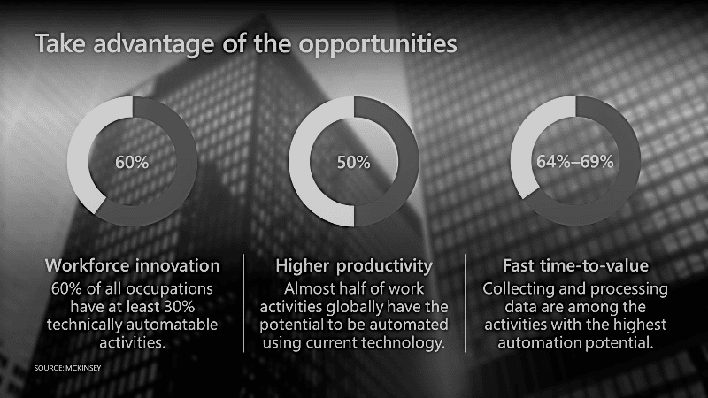
He showed the slide below and introduced us to the Microsoft Power Automate tool which aims to deliver more business value by facilitating this automation and importantly freeing up employee’s time to do other, potentially more impactful tasks.

The tool is cloud based so it can automate at scale. Using something called AI builder, it is also possible to gain knowledge from unstructured data which was demonstrated by training a machine learning model to recognize a particular document style. Using a Power Automate flow, Emanuel was able to extract data from an e-mail attachment that had the same style as the trained model which was stored in the Common Data Service. This flow then generated an approval workflow which was integrated into Microsoft Teams.

Power automate

Smarter retail

On I ventured into ‘The Hub’ to see some of the exhibitors, I found the Intel/Microsoft/Neal Analytics project really interesting. Using a combination of a Microsoft Surface Studio, camera and the Microsoft Azure Edge Stack powered by Intel processors, it is possible to revolutionise the retail experience.

In the demo, a customer walks up to the Surface Studio, the Azure Edge Stack device utilises AI to determine whether the customer is new or returning through facial recognition. This information is sent to the store manager who will then deliver a personalised experience based upon this information. The AI will consider the returning customers purchase history to further tailor their experience and the AI doesn’t stop here. As we know well here at Ipsos Jarmany, data is only as good as its source. The dashboard shown on the screen has been enriched by using AI to count the stock of items to enrich the sales/stock data information.

Smarter meetings

By far the most popular session of the day was Intelligent Communications with Microsoft Teams presented by Angela Donohue. As a frequent user of Teams, I was aware of many of its capabilities – however Angela introduced me to something brand new.

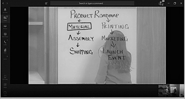
Quite often in face-to-face meetings you might have some remote participants who are ‘dialling in’ and there is an unavoidable disconnect between those physically present and those who are not. Digital whiteboards have been generally available for a while in Teams meetings but physical whiteboards in meeting rooms aren’t going away. If a physical participant is standing in front of a whiteboard, the remote participant can’t see what’s on it.

The new Microsoft Teams Rooms Content Camera utilises cameras in combination with AI to make the meeting an inclusive experience for all – very cool!

Product roadmap

Smarter IT operations

Another recent innovation on the Azure platform through the Intune product is Windows Autopilot. Microsoft have partnered with OEMs such as Dell, HP and Lenovo to allow new devices to be pre-configured with corporate images and set up for a new meaning IT can provision machines in minutes.

Another of my favourite presentations was Securing your cloud perimeter with Azure Network Security by the very amusing Albert Chew. Albert told us that with the shift of data from on-premise to the cloud mean network security practices from 10-15 years ago no longer cut it and organizations must be more proactive in protecting their data and infrastructure. They should embrace the Zero Trust Architecture which has a couple of key principles.

  1. Verify explicitly – this means we should make sure the user is really who they say they are by considering other factors such as their location or their device hygiene.
  2. Least privilege access this means only giving access to exactly what users need with no higher level of access than required.

Given the vast number of data breaches over recent years you should assume your personal information is out there.

Microsoft want us to embrace three tiers of protection with our applications in the cloud. Protect the application itself, sing something like a Kubernetes container or DDoS protection; protect the infrastructure using network security groups and finally use a cloud-based firewall such as Azure Firewall.

It’s not all about the technology

And finally, my favourite presentation of the day was ‘Learning from Failure presented by Gabriel Nepomuceno from the Microsoft UK One Commercial Partner Team. Inspired by the whitepaper How Complex Systems Fail by Richard I. Cook, MD, Gabriel explained that complex systems are never 100% reliable and catastrophe is always around the corner.

The Boeing B17 Flying Fortress was involved in a series of accidents during WWII. Other accidents like this had shown a similar series of events before the accident occurred. The pilot would land the plane but then suddenly, the landing gear would suddenly retract, and the plane would collapse onto the runway. On each occurrence, investigators looked for evidence of mechanical and electrical failure but were not able to find any. Every incident was attributed to pilot error – really?

There are four common traps we as humans fall into when managing incidents:

  • Attribution to human error – As soon as we do this, we stop investigating further and fail to discover the root cause. In the case of the B17, the cause was a faulty design in the cockpit. Both the flaps and landing gear switches were less than an inch apart from each other, identical in appearance. This meant that when the flaps were being retracted by the pilot upon landing, they also accidentally retracted the landing gear.
  • We talk about what didn’t happen instead of focussing on how the incident occurred
  • We don’t consider the logical reasoning of the human at the time of the incident by using negative adverbs such as “carelessly” and “negatively”
  • Mechanistic reasoning which makes us believe that once we’ve found the faulty human, we’ve found the problem

Closing thoughts

It was a thoroughly enjoyable experience which allowed me to develop my understanding of the Azure platform and has inspired me as to how I can implement some of these new technologies into my day to day work with my clients at Ipsos Jarmany. Oh and I do love a free t-shirt, I’m a developer after all…

The 5 tools a data analyst can’t do without

The 5 tools a data analyst can’t do without

In this post, we will be discussing the 5 tools that an analyst needs to know to succeed in the field. These tools will help any analyst be faster and better when it comes to analysing data, problem solving and providing insights.

  1. Excel

Across all industries, Excel is the tool that sits on the Iron Throne as the most popular amongst analysts and decision makers. It’s so widely used because:

  • Everyone has Excel on their machine
  • It provides great functionality for non-technical people
  • Data can be manipulated to suit the needs of the user
  • It’s generally simple to learn and use

So, data analysts will need to be masters of Excel as they are likely to be using it daily. Some practical examples are:

  • Running / Refreshing / Creating new reports
  • Where you need additional data for your analysis and the data is an Excel file within the Marketing team – > You will need to get that file and input it in your Database
  • You need to send out a quick ad hoc request that shows the sales per day – > you can quickly summarise data using Excel
  • You want to create a lookup from scratch (product or store lookup for example) -> you can create it in Excel and then input it in your database

Therefore, I suggest you make Excel your best friend if you want to pursue a career in analytics.

  1. SQL (or other databases)

SQL is the place where your data will likely be stored so you will need to know how to use it if you want to work with data. SQL (Structured Query Language) is a programming language which data analysts use to interact with their data. Usually, there is a database administrator who is responsible for the maintenance of the Database; making sure the new data is correctly stored in tables and all updates happen flawlessly. If you join a smaller organisation you might have to do this yourself (heads up!); don’t worry though, it’s an opportunity for you to understand how databases work in general.

Data analysts will be using SQL for the following reasons:

  • Data input – all the relational raw data will be inputted into SQL
  • Data cleaning – this involves removing empty columns/rows, removing duplicate values, updating data, creating error checks, triggers & deleting unnecessary data
  • Data transformation – this involves bringing multiple different data sources together or pivoting the data in different ways
  • Data modelling – This involves creating rules for your data or creating calculated fields
  • Data storing – saving the output of your analysis or the raw data into tables
  • Creating views – these views will be a set of queries that bring the data together, transform it and model it for a specific problem (sales Vs target for example). Then you can connect these views with your visualizations tool or Excel and create an automated dashboard

There are more things you can do with SQL, but the above list has the basics that an analyst will need. SQL will also help you in the future when the data will be saved in the cloud (big data tools) because it integrates very well with the major cloud services such as Azure, AWS and GCP.

  1. Visualisations tools (Power BI, Tableau and Qlik Sense)

Visualisation tools such as those above will be relatively new to most businesses, but they are starting to gain traction. As an analyst, these tools will help you communicate your results in a more modern and graphically rich environment verses Excel. Additionally, these tools provide more functionality to Excel such as:

  • More table / graph options to use
  • Are more interactive and interconnected
  • Offer more advanced analytics by integrating with Python & R
  • Have the ability to handle big data better

The biggest mistake I see when using these tools is that they are mistakenly taken for databases because they have an option to create a ‘data model’ with multiple connections (joins) and calculated fields. If you have medium to big data and try to do the above, your visualisation tool will be slow and clunky – the result being people reverting to Excel. Best practise is to build your model in SQL or a Big Data database and then bring 1 table/view into your visualisation tool – yes, it will take more space, but the report will be fast and usable.

  1. Python and/or R

Python and R will help you when it comes to machine learning (ML) projects such as making predictions, forecasts and run rates. Usually, these projects are run by more advanced data analyst or data scientists.

Personally, I believe that the urge to learn ML will come having mastered the basics mentioned above. In order to start learning, I recommend:

  • Setting up your Python or R environment (it’s free) using Anaconda and Jupyter Notebooks
  • Start by running simple statistics like Person Correlations – PLEASE try to interpret the results
  • Then try running basic unsupervised models like Linear Regression, Logistic Regression, Naïve Bays and Decision trees which are easy to understand
  • Then learn some unsupervised models like K Means or Hierarchical Clustering
  • If you master the above, move to Deep Learning models and start using TensorFlow, Keras or PyTorch in your GPU or Virtual Machines.

Fun right? The last bullet point is maybe a bit advanced for an analyst but nothing that cannot be achieved with practical practise (and lots of googling). And you’ve always got the data analyst/scientist community who are amazing at sharing knowledge and always happy to help.

Please note that the ability to learn new software fast is critical as it might be Python and R today but could quickly be something else tomorrow.

  1. Big Data tools like Microsoft Azure, Amazon Web Services (AWS) and Google Cloud Platform (GCP)

Traditional on-premise databases cannot handle the ‘big data’ organisations now generate, thus the need to move to cloud-based solutions like Azure, AWS and GCP. You will still be using SQL, Python and R as the big data tools as they integrate very well together. Typical challenges that exist:

  • Your organisation has a data lake where all the data is stored, and you need to know how to get there or how to connect to it. Or maybe you want to store data there yourself.
  • Maybe you want to create a cluster (virtual machine) to run a big data query or model. You will need to know how to configure the cluster yourself which is relatively straightforward; select the processing power you need & the RAM and you are good to go.

The point is that, as we move to the world of big data, there will be new ways of doing things that as an analyst you should be the first to know how to use and apply. Plus, these big data cloud skills are very high in demand!

I hope you enjoyed this read! If you did, then please consider subscribing to my YouTube channel as I will be sharing more content on data analytics. If you have different views or there is something you want to comment on or even just ask me a question, please let me know in the comments section.

https://youtu.be/IO6EtMkim_4

What is data analytics? 5 things you need to know

What is data analytics? 5 things you need to know.

It’s the 21 century and everyone is talking about the big data explosion and that data is the new oil. A report by IDC Data Age (2025) estimated that there will be 175 ZB (we are currently at 40ZB) of data generated by 2025. But this data needs to be stored correctly and analysed.

So, in step data analytics, but what is it – in this post we will be reviewing the 5 things you need to know about data analytics.

  1. What is data analytics

Data analytics is the art of taking some raw unstructured data and using it to build models that leads to better decision making. And in conducting the above process, you will be using a set of tools that will help you be more efficient and effective.

For example – the processes of taking 2+ raw data files in Excel, joining them together, cleaning & transforming them, modelling them and then creating some sort of outcome is the art of ‘data analytics’.

  1. How can data analytics add value?

In general, data analytics helps organisations or individuals make better, informed decisions by justifying/supporting them with data/evidence. Some examples of how data analytics can add value are below:

  • It can help organisations ‘gain visibility’ across all aspects of their business when measured against KPI’s. Examples include: WoW revenue, footfall, traffic & stock analysis
  • It can help organisations ‘increase their revenue’ by identifying potential opportunities or underperforming activities
  • It can improve ‘operational efficiency’ by accelerating all of the tasks, automating them and minimizing manual work
  • It can ‘optimise marketing campaigns’ by tracking the campaigns, the money spent and the connection between the two
  • It can ‘increase response times’ with customers, clients and partners
  • It can ‘identify new trends, new opportunities and new markets’
  • It can provide ‘real time analytics’
  • It can provide ‘competitive edge’ over rivals
  • It can assist in ‘future planning’ by forecasting/predicting the performance of the business

By reading the benefits above, you can see why all organisations realise they need to be ‘data driven’.

  1. Data analytics methodologies (EDA vs CDA)

Data analytics could be separated into 2 ‘methodologies’; Exploratory Data Analysis (EDA) and Confirmatory Data Analysis (CDA). EDA is the process of trying to identify patterns and relationships whereas CDA is the process of using statistical methods to determine whether a hypothesis is true or false.

The kind of tasks performed within EDA are as follows:

  • Aggregating the data in different ways to get insights (SUM, MIN, MAX, AVERAGE, COUNT)
  • Visualising the data in different ways to identify patterns (bar charts, line graphs, pie charts, etc).
  • Checking the distribution of the data
  • Checking for duplicate values, missing values or incomplete datasets
  • Filtering the data across multiple categories and investigating if there are any patterns

Think of EDA as almost like the work of a detective where you are investigating a case (dataset) across every possible angle to get insights. All recurring daily/weekly/monthly reports could be considered as EDA analysis as well as the initial stage of machine learning projects.

CDA is where you will test if your hypothesis formed from EDA is true or false. CDA utilises statistical methods such as significance, confidence and inference to challenge any assumptions made in your EDA.

Some of the techniques/models that CDA relies upon are:

  • Supervised learning models like: Linear Regression, Logistic Regression, Naive Bayes, Decisions Trees, Support Vector Machines & KNN.
  • Unsupervised learning models like: K-Means & Hierarchical Clustering (although these models are very challenging to evaluate performance of)
  • Variation Analysis (ANOVA)

CDA is mostly used when you are trying to predict something and you need historic data to create a model that predicts the future.

  1. Quantitate vs qualitative analytics

Data analysis can be broken down into quantitative and qualitative analysis.

Quantitative involves using numbers and quantifiable variables that can be measured statistically or compared to each other. Qualitative analysis involves using text, audio, images, interviews and video to understand the concept of non-numerical data and the story within it.

From my experience, even if you have to do some qualitative analysis, you will need to find a way to categorise your data and make it comparable with something in order to arrive at any conclusions. There are models that can analyse text, images, voice and video and categorise them in a way that you can apply quantitative analytics to them.

  1. Types of Analytics

Another way of breaking down data analytics is by type – there are 4:

  1. Descriptive Analytics: When you use data to describe what has happened over a specific period of time such as the automated daily/weekly/monthly reports that an analyst will typically run – they answer questions like:

    • What is the WoW revenue performance?
    • Where are we against our targets?
    • Which products are performing the best?
  2. Diagnostic Analytics: This step is using ‘descriptive analytics’ to explain why something has happened. For example, after answering that WoW revenue is up by 20%, you will have to investigate the ‘why’ and the what product, category, area, industry, manage, seller has driven that 20% increase.

  3. Predictive Analytics: In this step, you will have to use historic data to make predictions for the future. You can choose statistical methods or rule-based models to make predictions. And you can answer questions like:
  • How much revenue are we estimated to achieve by the end of the year
  • Will we meet our targets by the end of the year? By how much? What is the forecast?
  • What segment does this customer fall in based on his/her characteristics?
  • What is the opportunity value if we increase marketing spend by 5%?
  1. Prescriptive Analytics: This is the step where you will be making your recommendations. For example, if you have identified that you will not meet the targets by the end of the fiscal year, you will need to recommend a course of action to the business as to how they could achieve those targets.

I hope you enjoyed this read and have gained a solid understanding of what data analytics is and what it entails! If you enjoyed this read, then please consider subscribing to my YouTube channel as I will be sharing more content on the subject of data analytics. If you have different views or there is something you want to comment on or ask me a question about, please let me know in the comments section.

https://youtu.be/nD3410mCAhA

References:

Reinsel, D., Gantz, J. and Rydning, J. (2018). The Digitization of the World – From Edge to core. [ebook]. Available at:

https://www.seagate.com/files/www-content/our-story/trends/files/idc-seagate-dataage-whitepaper.pdf [Accessed 18 Aug. 2019].

The skills you’ll need to be a great data analyst

The skills you’ll need to be a great data analyst

The world is exploding with data; more data that we can possibly handle. Organisations are seeking to employ more data analysts. Young, talented and ambitious individuals are keen to start a career in data. But what does it take? In this post, we will be discussing the 5 + 1 skills that an analyst needs to be successful in this field.

  1. Ability to turn data into insights

The most important skill that a data analyst (even a data scientist) must learn is the ability to turn data into insights. This is often overlooked, but the reality is, that if you are not able to translate your analysis into valuable and actionable insights then your organisation will not value you. You will need to analyse your data by measuring the right thing and asking the right questions.

To really master insights, you’ll need to be able to tell a story using the data. You’ll need to articulate the why and present your analysis in the right order with very clear visuals.

  1. Problem Solving Skills

In the real world of data, no problem is the same and no solution is the same either. There are no fixed rules that mean you can follow and solve every problem simply.

You will need to be able to solve problems efficiently and effectively. By efficiently I mean that we do not live in a perfect world where we have all the resources available to us; we need to solve the problem with what we have and ensure it’s the best possible solution we can deliver. By effectively I mean that our solution should solve all of the problem and not just some of it.

Analysts should clearly state the problem they are trying to solve.  They then need to identify the information they need to solve that problem, gather that information and join it together, they can then use their well-honed analytical techniques to model the data and start analysing the outcomes that arrive at a solution and so answer ‘why’ this has happened and ‘how’ we can tackle it – problem solving – done!

  1. Technical Skills

‘Technical skills’ are the most obvious skills a data analyst will need. Technical skills will help the analyst to be faster and better when it comes to problem solving, analysing data and providing insights. At an industry level, the most used software is Excel so whether we like it or not, data analysts should be masters of excel. Managers, Senior Managers, Directors and Executives will want a relatively simple software package they understand and that in some cases can give them the ability to manipulate the numbers themselves.

The next most popular technical skill is SQL; or other databases where you can still query using SQL. Looking at the fundamentals, all the data that you will be using would sit within SQL, so it makes sense to learn SQL in order to extract that data and start your analysis. SQL also integrates with the majority of visualisation tools (and big data tools like Azure, AWS, GCP) allowing you to automate all your reports.

I would suggest learning how to use visualisation tools like Power BI, Tableau & Qlik Sense. These visualisation tools have more functionality than Excel and are able to handle big data better than Excel.

Worth noting that if you use there tools as ‘databases’ and have your ‘modelling’ and ‘joins’ within the tool then the tool will be effectively useless as it will take ages to run/filter. I have personally experienced this, many times in my day job and it’s one of the main reasons people find those tools hard to use – this can often lead to a reversion to Excel.

Finally, I would suggest learning Python and/or R. They are really useful skills when it comes to machine learning (ML) projects such as making predictions, forecasts, run rates and other statistical based projects. Usually, these projects are run by more experienced data analysts or data scientists.

Please note that the ‘ability to learn new software fast’ is critical as it might be Python and R today but that could change tomorrow. As an example, digital data analytics is relatively new and has new tools and processes to measure the data.

  1. Communication Skills

Data analysts don’t just interact with computers, (although some of us wish that were the case) they also interact with people often for the following reasons:

  • You might have done a great piece of analysis and have to present your results to the business
  • You might need some data that is not in the database and you will have to go and talk to other people to get that data
  • You might have been asked to help a certain team analyse their performance and you’ll need to sit down with them, understand their business and map the project/analysis from conception to conclusion.

So yes you are going to need to have good communication skills too.

  1. Critical thinking

Critical Thinking is not the same as the problem solving described above. Critical thinking is when you challenge your own presuppositions/assumptions.

Questions like:

  • Maybe I am wrong and not thinking this through clearly?
  • Am I doing this right?
  • Is there another way of doing it better? Faster?
  • Is there a hidden reason why ‘x’ is asking me to follow this direction?
  • Why this way over another?

Problem solving will typically have an end date as problem while critical thinking is an on-going process that you should apply throughout your career. The reason I have included both is because as an analyst, critical thinking will help support problem solving and should mean your recommendations are stronger.

5 + 1. Creativity

Creativity is an art however and wherever you apply it. As a data analyst, you will be presented with multiple scenarios that often have no right or wrong answer. Hence, you will need to get creative when providing solutions. Creativity can be applied in the following scenarios:

  • You can get creative on the type of model or software you use for your analysis
  • You can get creative when designing new reports / visualisations for the business
  • You can get creative in including more data sources in your analysis to get a more complete picture
  • You can get creative on how to present your insights by telling a story
  • You can get creative by experimenting how to automate all your work, so making it faster

I hope you enjoyed this read! If you did, then please consider subscribing to my YouTube channel as I will be sharing more content on data analytics. If you have different views or there is something you want to comment on or even just ask me a question, please let me know in the comments section.

https://youtu.be/I1MOn8kyc14

Getting Started as a Data Analyst

Getting started as a data analyst

In very simple terms, a data analyst job is to translate numbers into plain English so the business can gain a better understanding of performance. However, in terms of their actual day to day routine, it’s a bit more complex than that. In this article, we will be discussing the 5 + 1 things that a data analyst does in his or her day job and the skills required for each step to be successful. Additionally, we will touch on the kind of tools and data, analysts use in each step.

1. Reporting

As a data analyst, you will be spending a lot of your time either creating, refreshing or running reports. These reports will likely be in the form of Excel or PowerPoint with commentary, and use visualisation tools like Power BI, Tableau & Qlik Sense. If you are creating a new report, then you will probably be using SQL, Excel or any other database; as it’s the place where the raw data will be saved after you collect it from other people or data sources. When I started working as an analyst, I was given responsibility for 5 different reports. I had to make sure that all the reports were refreshed on time, with the correct data and that they were sent out to the right stakeholders at the right time. For example, I had a marketing report, a retail report, a product report, etc and each report had a different group of stakeholders. This is actually a good way to start your career as you get exposure to the wider businesses and start to understand how different teams use their reports. This will give you the confidence to start creating your own reports. The kind of skills you need in this initial step are the following:
  • data gathering skills
  • data cleaning skills
  • data transformation skills
  • data storing skills
  • technical Skills – SQL, Excel, database knowledge, BI/Visualisation
  • organisational skills & attention to detail
  • punctuality – ensuring the reports are out on time

2. Analysing the data

After refreshing the reports, you will be spending time looking at the data and trying to understand it, looking at the patterns and the performance of what you are reporting. In some cases, the reports alone will not be sufficient for your analysis and you will have to spend extra time pulling and analysing more data from the database in order to complete your analysis. After the analysis, you will be writing your commentary/insights – think of this as a story of your findings. While going through the process described above you will then to need to check you work for any obvious errors/mistakes in the data/reports, having business knowledge is critical here. The kind of skills you need in this step are the following:
  • problem solving – no solution will be the same hence your problem-solving skills will be challenged
  • ability to ask the right questions
  • business knowledge
  • fixing mistakes

3. Presentation of results

After finishing your analysis, you will have to present the results back to the business. This will usually be in the form of a PowerPoint presentation. This is often the skill that the business values the most in a data analyst. It does not matter how good your coding/ modelling/predicting skills are if you are not able to turn your findings into insights and business recommendations. By mastering the ability to turn data into insights and being able to communicate this to the business will see your career start to move in a positive direction. The kind of skills you need in this step are the following:
  • insights
  • storytelling
  • communication skills
  • agile thinking
  • strategic thinking – align your analysis with the business’s strategic objectives

4. Ad hoc analysis

The next thing you will likely be doing is ad hoc analysis. Ad hoc is usually a specific request that crops up on the back of your initial presentation or frankly any meeting with stakeholders in general. It’s typically just a one-off analysis on a subject of interest. For example, you have identified from your analysis that category X had an amazing week last week. Maybe your manager will ask you to do an ad hoc analysis on why category X performed so well? What are the drivers? Ad-hoc analysis is a good way to show your creative thinking and problem-solving skills as it’s different from the standardised reports that the business has. In this step, you can also demonstrate your machine learning (ML) skills (if you have some); that is if there are applications of ML that would benefit the problem you are trying to solve verses what can happen which is trying to force ML in because you think it will impress. The kind of skills you need in this step are the following:
  • problem solving
  • data gathering
  • asking the right questions
  • time management

5. Automating all processes

As an analyst you will have to learn to work smart and not just hard. The majority, if not all reporting should be automated using SQL (or similar) to Excel or SQL to one of the visualisation tools. There is a smart way of creating reports so that as soon as there is new data in the database, all you have to do is press “run” and “refresh” and within 10 secs all the data is cleaned, transformed, modelled and refreshed. The obvious benefit of this, is that you can save a significant amount of time which you can then spend analysing the reports and adding more value to the business. The kind of skills you need in this first step are the following:
  • technical skills
  • methodical thinking – you’ll need to think hard about the order of doing each task and when and why.
  • ability to see the bigger picture – if you recognise the benefits of automation then you can really add value to the business.

6. Build machine learning models

This step is mostly for advanced data analysts that know how to use machine learning. It’s not something that an analyst will spend much time doing but at some point in your career, you will build or be involved in building a machine learning model. Personally, I believe that the urge to learn will come naturally in all good data analysts after mastering the basics discussed above. The kind of skills you need in this first step are the following:
  • ML knowledge – start by learning some basic models like linear regression, logistic regression, naïve Bayes & decision trees for supervised learning & k-means for unsupervised learning.
  • Python or R skills – I recommend Python but R is equally good.
  • statistics – correlation analysis will be very useful
  • advanced ML libraries like TensorFlow, Keras and PyTorch (GPUs or VMs)
  Ready to kickstart your career in data and analytics? Apply to our graduate scheme today

Inclusion means more of everybody

“If you want to serve the world, you have to represent the world” (Satya Nadella, 2018)

Women in Tech

On Wednesday 28th February 2019, I attended the ‘Microsoft Women in Tech’ conference with two of my colleagues – a conference designed to shed light on the dynamic culture change in the technology industry and empower women within a male-dominant environment.

What diversity and inclusion means to Microsoft

Nicole Dezen, General Manager for the Consumer Devices (CDS) division in Microsoft UK, outlined Microsoft’s active movement away from the binary understanding of diversity and inclusion, originally anchored in gender, to creating an atmosphere that fosters the development of all. From Satya Nadella’s appointment as CEO 5 years ago, there has been a noticeable culture shift to developing an objective workplace community. A proportion of Senior Leadership Team (SLT) compensation is dependent on the inclusivity rate of the company, mapped against publicly available figures.

And some interesting statistics for diversity and inclusion in the US

A survey of American workers saw that 80% agree that inclusion is an important factor in choosing an employer, with 72% saying they would leave an organization for a more inclusive one. Gender diverse companies are 15% more likely to financially outperform non-diverse companies, and ethnically diverse companies outperform further by another 20%. These figures become more profound when you learn that by 2025, 75% of the workforce will be millennials, and of those millennials 43% will be non-white. If companies are unable to retain minority workers, they will inevitably loose critical talent that could cost them dearly.

Women in STEM

The disparity in the numbers of girls that carry on STEM subjects from GCSE and those that fill STEM jobs is ever growing. Girls cite “low confidence” and “lack of role models in the industry” as contributors to the 14.4% rate of representation in STEM industries*. There are some positive anomalies, with Bolivia having above average female representation at 63%; conversely in the UK only 11.5% of total STEM management are female*.  

As the growth in STEM industries outpaces all other sectors, in the context of the Fourth Industrial Revolution, taking active measures to engage more pockets of society will undoubtedly lead to future successes.

How do you keep them once you’ve got them?

One remark that stood out from the conference was that ‘diversity in hiring is easy’ – however it is keeping people that poses the biggest challenge, hence why both diversity and inclusion targets are crucial – the sense is you have to actively force the issue at least initially to drive the culture change.

And there’s also mindset and behavior to consider

Striving to empower; incite confidence and nourish grit and determination in employees is key.  Helen Slinger – the Chair of BT NW Board of Directors stated that people can often feel like saying it’s only a matter of time before they find me out and/or they are not worthy of the responsibility they have been given. Therefore it imperative that they are encouraged and given the confidence to tackle these quite normal emotions by stepping out of their comfort zones into what learning coach Sarah Perugia calls the ‘learning zone’. Learning to manage your behaviour and in effect ‘fake it until you make it’ can ultimately increase your confidence and your opportunities. Physically taking up space rather than hiding from it is a good analogy.

During interactive sessions, we participated in discussions that highlighted the personal impact of our actions, understanding how to be an ‘explorer’ – by being adventurous and brave, rather than a ‘prisoner’ – being trapped in our environment. Interestingly, we discovered that when a woman nods, it is a sign she is listening, whereas when a man nods, it is a sign he is agreeing – as you can imagine this can lead to a lot of misunderstanding in the corporate world! We became conscious of what inclusivity encompasses; the environment created to encourage or support all and the consequences of acting as ‘culture carriers’ as you unknowingly impact others.

The 5 Second Rule

What should be your initial reaction when offered a new opportunity or project, or you have an instinct to act on a goal? Typically, it’s a negative one – people feel compelled for some reason to always think of the reasons ‘why not’ instead of ‘how can I’. Start by remembering this and then count backwards from 5 to 1, then move physically away! This eliminates the ‘devil on the shoulder’ mentality that causes procrastination and doubt. By being open minded opportunities will become more plentiful and maybe more importantly you will be seen as the positive light – nobody likes a ‘drain’ do they…

What’s Next?

We found the Women in Tech conference incredibly motivating. Currently, women are the fastest growing demographic – simply put, the future need for female representation is becoming ever more apparent. Continuing pressure should be applied to attract the pipeline of individuals who can play an active role in the future of the industry – spanning beyond just gender to race, sexuality and disability.

We heard about the positive impact of initiatives such as ‘Barefoot’ and ‘DigiGirlz’ aimed at school children, which give kids the experience of coding which simultaneously counteracts the masculine stereotype associated with it. Early exposure will also remove the hesitation and intimidation frequently associated with Data and Computer Science and encourage a career in STEM.

Final thoughts.

For there to be an inclusive STEM industry, the technology sector must be representative of all. This can happen through grassroots initiatives, creating a positive atmosphere and inciting change when we acknowledge who isn’t in the room.

We gained a real insight into the future culture of the technology industry and felt motivated to become our best selves as we develop through our careers. We now plan to foster what we have learnt, into our own culture at Ipsos Jarmany.

And a sharp, slightly tongue in cheek quote from Madeleine Albright:

“There is a special place in hell for women who do not help other women”

Girls in STEM: These figures show why we need more women in science, tech, engineering and maths

Empower your people to be truly data driven

Succeeding in the digital era is heavily dependent on an organisations ability to develop a data literate workforce.  This is not simply providing your employees with access to data but enabling them to develop the required skill-set to read, analyse and scrutinise the data.

Moreover, creating a data-driven culture is about empowering all employees across all departments to have a mentality whereby data underpins all business decisions.  Companies who adopt a data-driven culture are 23x more likely to acquire customers, 6more likely to retain and 19x as likely to be profitable as a result – McKinsey Global Institute.

Most organisations acknowledge that by capturing all the data that flows through the business means they can gain significant value from applying analytics.  But, does acknowledging the value of analytics correlate with being data-driven?

An EY report has shown that while 81% of organisations support the concept of data being at the centre of everything they do, only 23% have implemented an organisation-wide data strategy.

Companies who’ve applied a data-driven strategy have done so by democratising the data and breaking down the silo corporate mindset.  These organisations encourage ongoing collaboration between departments and develop cross-functional processes to support information sharing. 

However, there are several obstacles in the way of achieving a data-driven business.  Data orientated goals seldom align with executive decisions and short-term strategies.  But more than that, without experience to guide the organisational change, a data-centric approach could be short lived.

If companies are able to overcome these obstacles, the value of data-centricity is undisputable.  Forrester research has revealed that companies who have made this transition to having a data-driven approach, are growing at an average of more than 30% each year and are predicted to collectively earn $1.8 trillion by 2021.

One of today’s global leading technology companies is striving to adopt a data-driven culture by breaking down the barriers to silo data across departments.  Where previously data was sourced across multiple complex platforms, they are working to centralise their data to empower employees to make more informed decisions through simple, self-service dashboarding. 

By organisations creating a data literate workforce and placing user empowerment at the heart of their data strategy, they will greatly improve each area of the business from product development to marketing initiatives.

Here at Ipsos Jarmany we believe there are 5 characteristics of a data-driven company?

  1. Data and analytics are incorporated into the organisations core strategic vision: These companies think through the role data will play within their organisation and long-term objectives.
  2. They implement the right tools: Tools and applications are selected based on shared organisational functions and objectives. Reducing the number of platforms and centralising the data increases use of application and information sharing across teams.
  3. Leadership not only supports data usage but establishes it as an integral role within the business: 45% of organisations have appointed Chief Data Officers.
  4. Data is not treated as a silo: Data-driven organisations value collaboration and develop cross-functional processes to encourage information sharing.
  5. They empower employees to develop skills to use the data and reward adoption: A recent survey by Gartner identified on average BI and analytics is adopted by 32% of employees.  A data-driven organisation far surpasses this average.

A company’s ability to gain control over how data is used to make business decisions is crucial to being competitive. A successful data-driven organisation will look at the data they collect and will use it to validate what they believe.  When companies stop looking at their data and just do what they believe, they will only see data in silos and will miss the bigger picture.

To transition from silo working to becoming a data-centric organisation, the culture of a company should encompass three principles:

  1. A culture where all employees buy into the concept of basing business decisions on data
  2. Create an organisational structure which supports a data-driven, analytically literate culture
  3. Provide accessible technology and applications which supports a data-driven culture and provides data at a self-service level

By creating a data-driven culture, an organisation will improve the management of their existing data, gain a better understanding of their customers and as a result create products and services that have real relevance.

Agile data analytics in action!

Working in an agile way with data can deliver immediate results!

New projects can often seem a little daunting to start with and generally, it is more effective to work collaboratively with others who are skilled in various disciplines that are not your own. The objective for one of our clients here at Ipsos Jarmany is to (phrased broadly) – make measurable improvements to the customer journeys on their website.

To achieve this end, an agile project managed workstream has been set up. And whilst a client would historically, have tasked one agency to provide a complete solution, in this event the tasks involve no less than three agencies, each with specific skill-sets.

A core aspect of this collaboration is a daily stand-up. Every working day from 9:30 to 9:45 I open Google Hangouts, put on headphones and sign in to a daily stand-up. I wave hello to the other people (most of the time, ten in total) on the call, and we proceed to go around the (virtual) room to update our co-workers on the previous days’ progress.

The people

These ten faces that ordinarily appear on the stand-up can be placed into 5 categories: data, UX, dev, brand and management. And for context I’ve outlined below what each of the roles is responsible for:

The Data Insight Specialists (that’s us).

  • Consolidate website interaction data to recommend areas of the site that require attention
  • Respond to UX strategy to assess its feasibility on site
  • Measure the performance of any live release

The UX Designers

  • Design the assets for a new web page, or element of
  • Inspire new design ideas as a product of their UX experience
  • Collaborate with legal teams to accommodate their requirements into the designs

The Website Developers:

  • Bring the chosen designs to life
  • Manoeuvre the constraints of the website to provide the best version of the design possible
  • Test and audit the code before live release

The Brand Representatives:

  • Ensure that the designs are in line with the client’s brand
  • Provide knowledge on current business priorities and help the workstream stay aligned
  • Communicate with the right individuals in the organisation to ensure the workstream’s progress

The Project Managers:

  • Take charge of the workstream schedule and ensure that it is adhered to
  • Follow up on any set-backs the team may encounter and see that the best solution is found
  • Liaise with all organisations involved and introduce the structure of work where needed

The structure

All groups operate in three-week sprints. Each begins with the creation of a backlog.

The UX designers, project managers, the data specialist, and the brand representatives sit together and decide on relevant user stories. For example, if a new homepage were needed, a user story may be, “As a user of this website, I want to navigate around the different areas of the site easily”.

The completed backlog is given to the design team. Once a final design is chosen, it is passed to the development team to decide on time frames for completion. As user stories are the starting point for each design, all design features align with a story, and hence each story has a time frame.

This process ensures the entire workstream keeps the future users of the website – the potential customers, front of mind.

What the data can tell us

Ipsos Jarmany’s role in this picture is data focused, and yes that does mean we report the numbers. However, this workstream has made it clearly apparent to me, the value, that these numbers hold.

Interactions with websites can illuminate so much about consumer attitudes and investigating the data in detail enables the collaborative team to view where customer experience can be improved.

We can investigate everything from how much visitors use a process on site – the research of the latest televisions available for example, to a page component popularity – the amount of video views the new television promo video received. 

This provides a window that is beneficial to everyone on the team. Business priorities can receive a steer from the individuals on site, design ideas can be edited with the same information, and the impact that changes have had can be assessed using these same dimensions.

Working in this way has been illuminating for how we fit within the current landscape of an online commercial business. With website analytics, we can get close to how users ‘feel’ about their online experiences, and its inclusion in this collaborative environment has cemented for me the value of this customer focused information.