The age of Big Data is creating an avalanche of information that will only grow over time, and with that comes the importance of how to visualise it. Extracting knowledge from data is undoubtedly the primary function of data visualisation, letting us breakdown vast amounts of information into manageable insights that are easy to interpret.
Today, it’s hard to think of an industry that doesn’t benefit from making data more understandable. And the pandemic is a very real-life example of how to communicate Big Data by delivering explanations and possible impacts that support government policy.
Beyond the pandemic, the rapid adoption of the Internet of Things (IoT) and Artificial Intelligence (AI) result in a massive data pool that needs visualising.
What is Power BI?
A good visualisation tells a story through combining data and art, and one of the tools at the forefront of empowering this is Microsoft’s Power BI.
Power BI is a visualisation tool that allows users to bridge the gap between data and decision making. By collating, cleaning and analysing data from a huge variety of sources, Power BI allows high-quality visualisation of data, achieved through self-service reports that boast a highly intuitive interface. The outputs are easily digestible for end users and allow organisations to share insights that drive rapid data-driven decisions.
Power BI Top 3 Features
1. Custom visualisation
Power BI boasts a huge variety of standard visuals to populate your reports with, each with extensive format options that enhance the presentation and functionality of any dashboard.
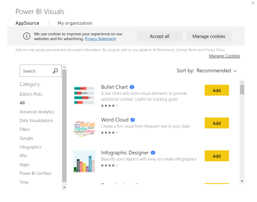
Power BI allows easy access to a library of additional free visuals such as Bullet graphs, Decomposition trees, Gantt charts and many more. All in-built custom visuals are shared with the Power BI community through the AppSource Market Place and can be imported in seconds ready to be used in your own reports.
However, every business operates differently and if the default selections are not sufficient, the powerful personalisation capabilities do not stop there; users can also build their own custom visuals to serve their complex data needs whilst maintaining consistency with their brand.
2. User-Friendly Interface
One aspect that sets Power BI apart from its competitors is the highly intuitive interface that makes it extremely user-friendly and easy to navigate. You don’t need dashboard experience to take full advantage of Power BI; outlined below are just a few of the many interactive features that allow even a novice user to get instant answers to their data questions.
Natural Seach Q&A:
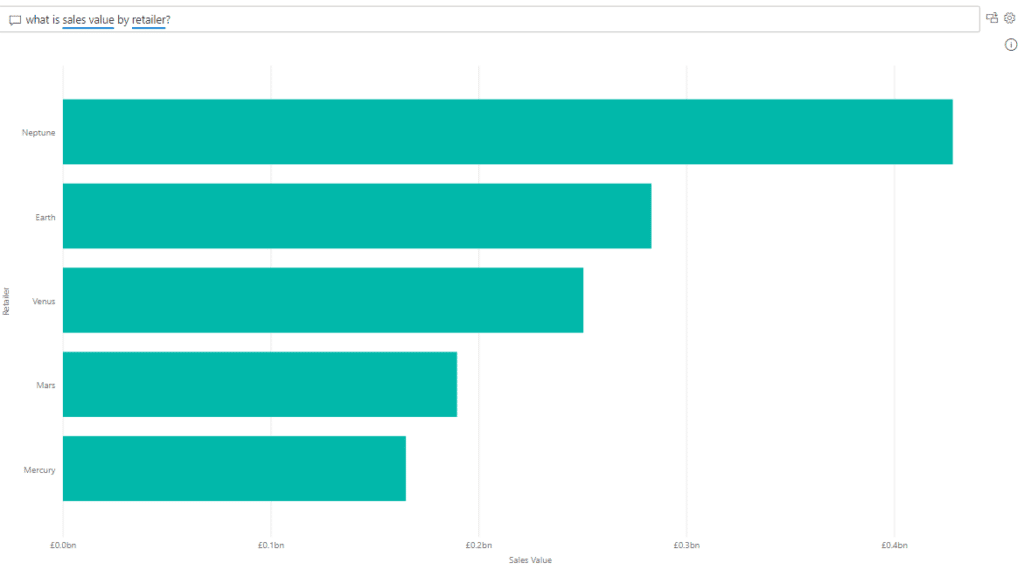
Some businesses may have stakeholders that aren’t particularly tech-savvy or simply don’t have time. Power BI’s natural language search feature is the perfect solution. It allows users to draw insights and create visuals using plain English search terms without any need for code or syntax. By double clicking an empty part of your report, you can ask specific data questions like; “What is the sales volume by region and by month?”. Power BI will run the related queries in the background and generate a visual that best represents the data you’ve asked for. The mobile Power BI application now also supports voice recognition Q&A so you can get answers to your data questions on the move.
Smart Narratives:
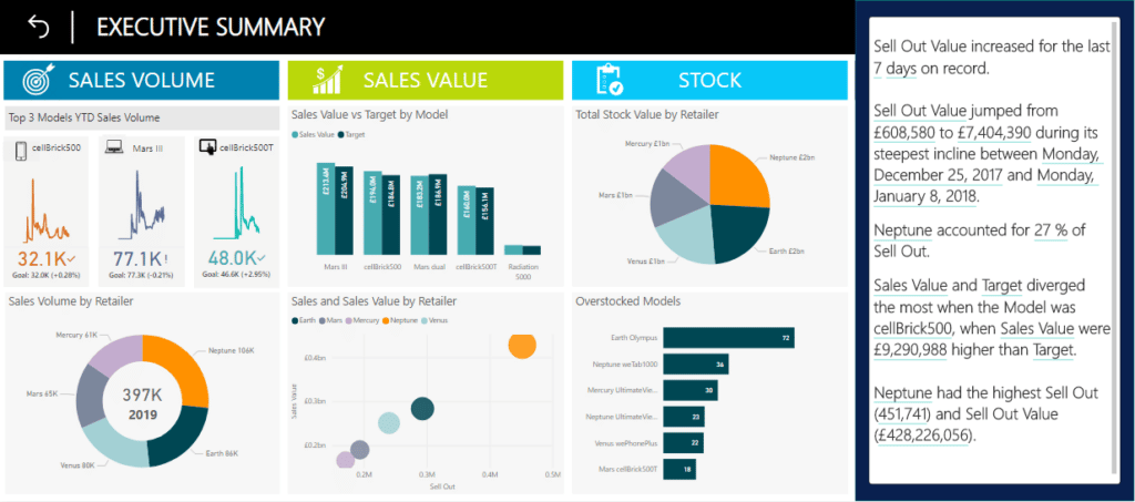
Good visualisation should always tell the story itself. However, sometimes words are helpful for identifying specific trends or addressing key takeaways. The smart narrative does exactly that through automatically summarising all the visuals on a report page and updating with every refresh.
The narratives can be customised by adding dynamic values; you can map text to existing fields in your data model or use the natural language search function to define a new measure to map text to, without the need to use DAX. Smart narratives are also dynamic and therefore generated text and values update when you cross filter on any visual.
This helps users understand the data and gather quick insights which they can communicate to others, without needing to spend time exporting screenshots of reports and writing up related commentary.
Cross-report Drill-through:
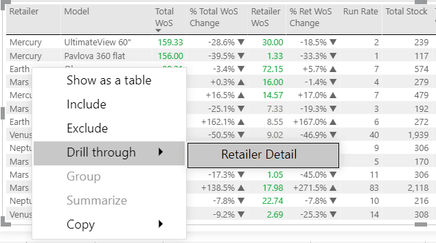
Another great option available in Power BI is the ability to “drill-through” to another report, allowing you to find related insights with ease. An ideal dashboard journey allows the user to start at a high level and then “drill-through” to more granularity in subsequent lower-level detail reports. Power BI’s cross-report drill-through feature does exactly that.
It allows you take a datapoint on one page and apply this as a filter on another page, simply by right clicking a visual. It connects two or more reports that have related content, and lets you jump from one report to another whilst passing filter context along the cross-report connection.
Different users of a dashboard will have different data needs depending on their role and you may want to build multiple reports for the various audiences. This feature allows you to tailor your data presentation for specific user groups without the need to cram every visual into one view.
3. Row/Object-Level Security
Row-Level Security:
Data security is imperative for businesses and there may be a need to restrict data access depending on the different roles and responsibilities of users. The Power BI platform has a robust Row-Level Security (RLS) infrastructure that allows easy implementation of this logic. Row-Level Security restricts data access on a given table by defining filters within roles, thus ensuring users will only see the data in accordance with their security permissions.
For example, a dashboard may be built with the purpose of serving both Sales Managers and Category Managers. The RLS solution built in Power BI would satisfy security requirements by only permitting Sales Managers to see data relevant to their region, whilst Category Managers can only see data relevant to their category e.g., smartphones.
Object-Level Security:
Power BI has taken this one step further through the addition of Object-Level Security. Object-Level Security (OLS) secures whole tables or columns that are not intended for a specific audience. This prevents certain users from discovering sensitive data such as employee or financial information. OLS improves your model security beyond RLS by completely hiding the model metadata. To viewers that don’t have permission, the secured tables or columns simply do not exist.
Both Object-Level and Row-Level Security can satisfy all audiences through a single source without having to create separate reports for each group.
Key takeaways
Power BI gives an end-to-end view of important key performance indicators through intuitive and interactive dashboard features, all in one place. This information is presented through vast options of pre-built visuals or the ability to customise your own. A combination of these tools allows business users to analyse data in real-time and share insights across all levels of an organisation with ease.
Try it yourself
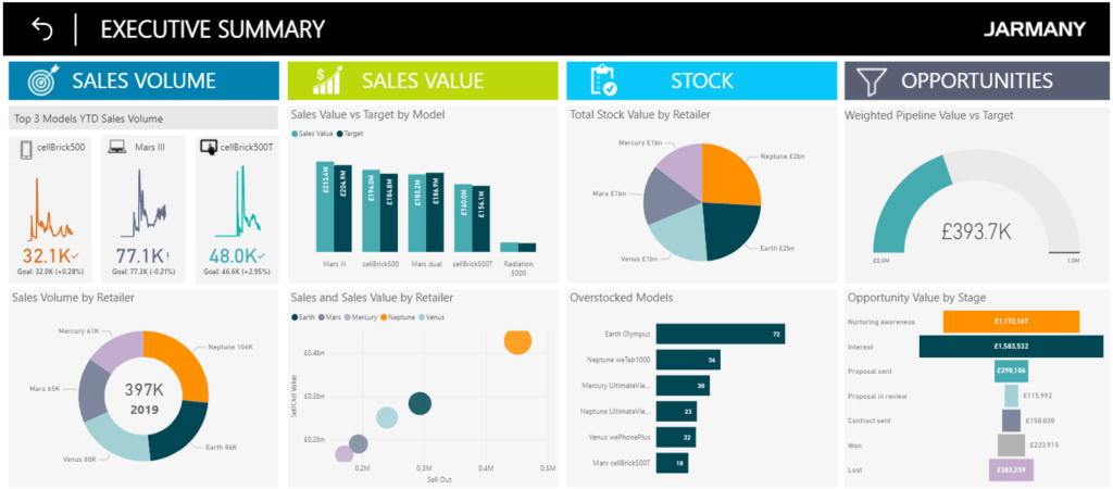
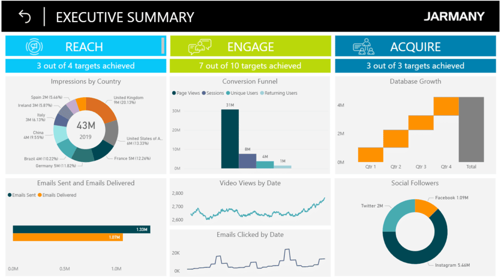
Now that you know what Power BI is and what some of the key benefits are, try it out for yourself using the links to our free dashboard demos.
About Ipsos Jarmany
Ipsos Jarmany is a team of expert Power BI consultants based in London, UK. Contact us to discuss how we can help you visualise your data through Power BI.


